Every design on this page came from The Howard Company's in house design team, and each one answers the same question: how do you turn a menu into a display that sells?
Alongside the examples you'll find the thinking our designers bring to every project, from layout and legibility to the details that quietly raise the average ticket. If you're not sure where to start, start with your bestsellers.
A good menu board leads customers to your highest value items with clear hierarchy, legible fonts, and photography that helps the customer decide. Browse your industry below, and see a few examples our team has designed.
BBQ Smokehouse
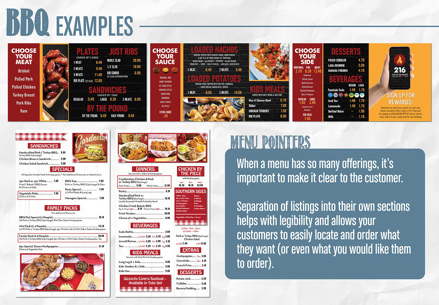
BBQ menus carry more items than almost any other quick service category, so the design challenge is order, not decoration.
The examples here zone every choice, meat, sauce, side, so a first time guest can build a plate the same way a regular does: pick the protein, pick the sauce, pick the side.
One board uses a classic checkered pattern, the other a dark modern palette, but both lean on contrasting color blocks and cropped photography to break a long list into sections the eye can scan in seconds.
Pizza
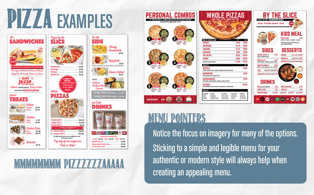
Pizza customers already know cheese and pepperoni, so the design job is showing off what's new.
The Geni's Pizza by the slice example uses three font weights so a full board still reads in clear layers, with photography breaking up each section.
The drive thru pizza brand example uses the same white board look but leans harder on images: the combo and slice screens use tighter photos and color blocked sections to keep listings easy to scan.
Both examples prove the same point: font hierarchy and photography doing the explaining.
Expert Design Tips:
-
Photograph specialty pies and combos. Skip photos for standards like cheese and pepperoni; the list is enough.
- Use a different font for headers, section names, and listings on the same board. That hierarchy alone makes a packed pizza menu easy to scan.
- Price whole pies in size columns (small, medium, large) so each pie lists once, not three times.
- Layout build your own as steps: size, sauce, toppings.
- Give whole pies, slices, and combos their own zones to streamline the ordering process
Chicken & Wings
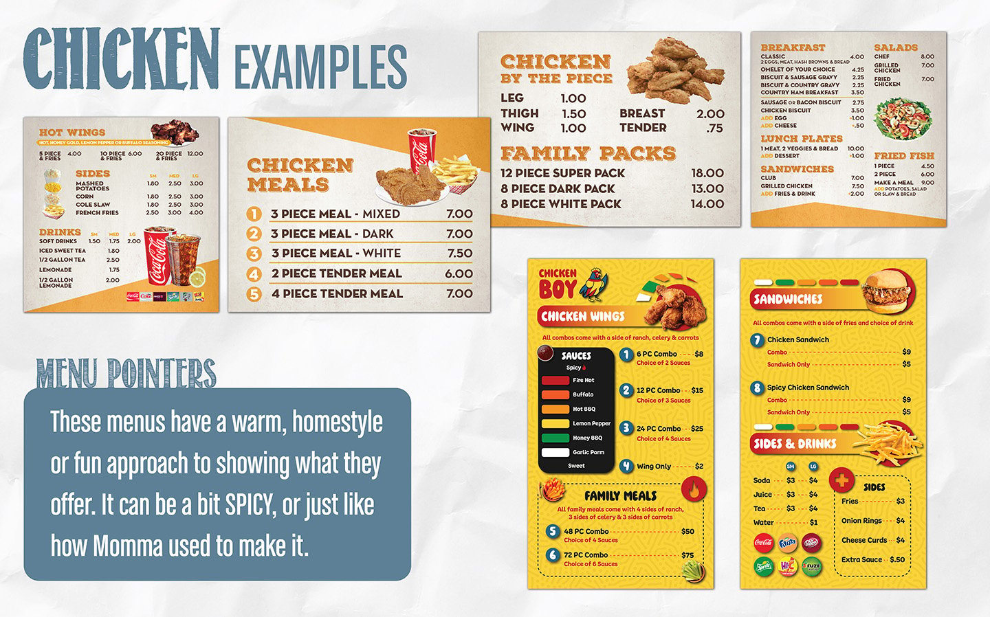
A restaurant's food and experience are what turn a first time customer into a regular, and the menu board is part of that experience, which is why no concepts on this page look alike.
The example shown on the top left, is a full indoor menu: because guests browse before they order, it carries more items, combos, and by the piece pricing without feeling rushed.
Drive thru example takes the opposite approach, a more vibrant design, built around a bold sauce heat scale, with limited photography and simple assets breaking up the sections instead.
Expert Design Tips:
-
Replace repeated wing pricing with one by the piece table: leg, thigh, wing, breast.
-
In a drive thru lane, a board gets about three seconds of attention. Big names, big prices, minimal fine print.
-
Use a heat scale graphic for sauces so guests answer the spice question themselves instead of asking the counter.
Italian
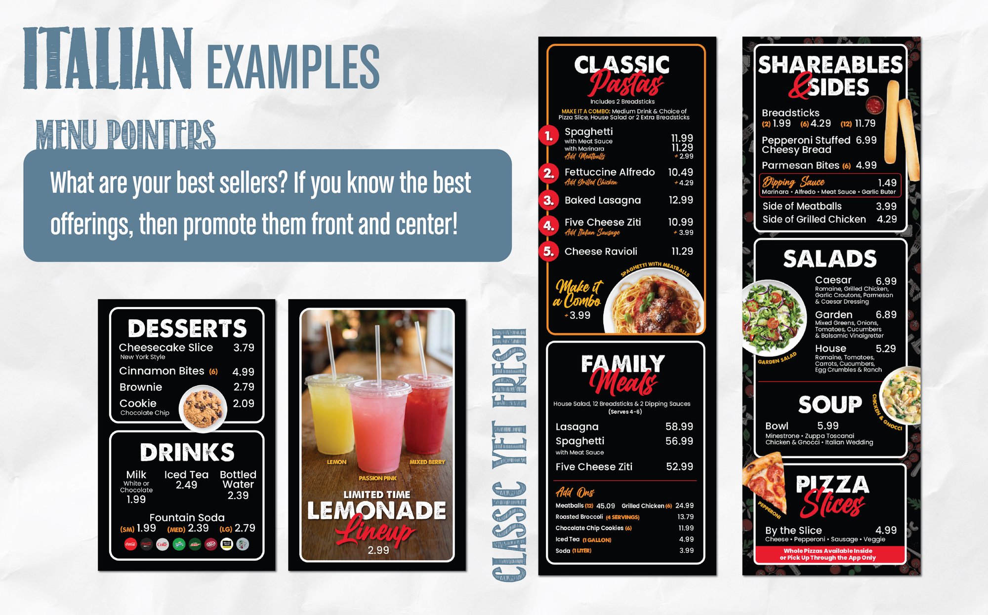
This drive thru board treats a fast food format like a sit down menu.
Five bestselling pastas are numbered at the top, so guests can order a favorite without reading the full list, while family meals, shareables, and salads each hold their own space instead of competing for room.
Limited time features live in a separated section of the graphic, gets full photography and still gets swapped out with a partial reprint instead of a full new board when it changes.
Expert Design Tips:
-
Organize by course. Guests already think in antipasti, pasta, entree, drinks, and dessert.
-
Family meal bundles that serve four deserve their own zone. They raise the ticket and travel well for takeout.
- Have best sellers stand out to grab the customers attention with animations, bright colors, or large imagery.
Cafe and Coffee Shop
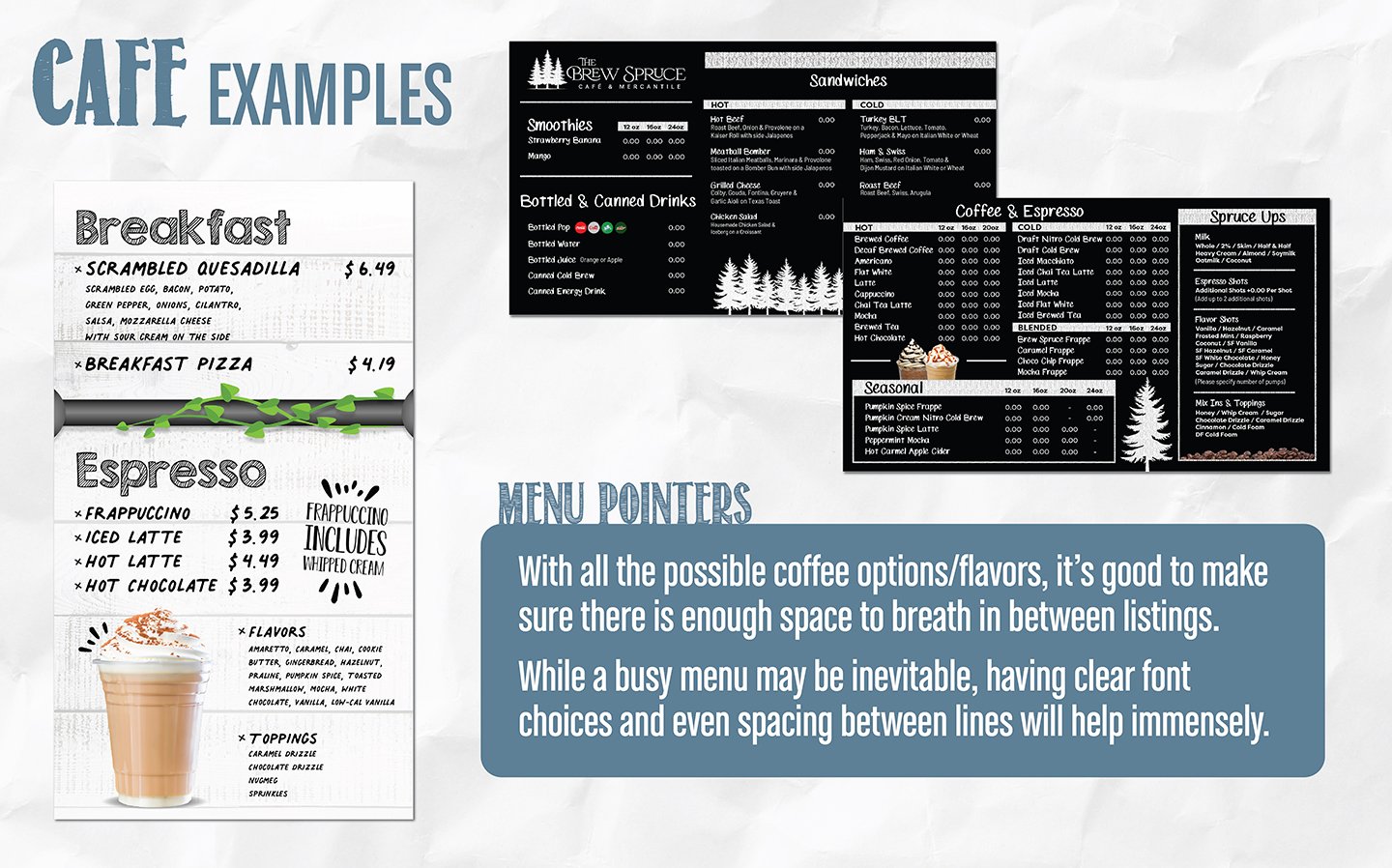
Coffee menus have to sort drink families, sizes, hot versus iced, and seasonal flavors without turning into a wall of text.
One example here pulls its design straight from the shop itself: an industrial pole divider and a wood grain background echo the physical space, paired with a font that feels handwritten but stays fully legible.
The other example puts a simple chalkboard look on a digital screen, a bigger list of drinks broken up with plain borders so it can be skimmed in the time it takes to walk to the counter.
Expert Design Tips:
-
Run sizes across the top of a grid and drinks down the side.
- List add ons and flavors once as a shared modifier list or icons instead of repeating them under every drink.
-
Leave real space between listings. A cramped coffee menu slows the line it's supposed to speed up.
-
Reserve one zone for seasonal drinks and design it to swap easily so a new flavor section doesn't mean a full redesign.
Deli and Sandwich Shop
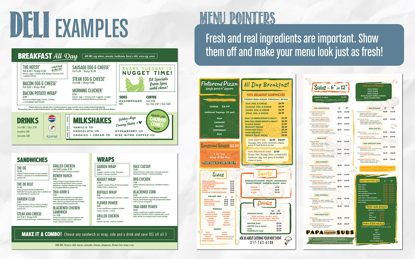
These two boards handle a long sandwich list in opposite ways.
The first leans on white and green tones throughout, with fewer individual listings and more of the work done by text and contrast, plus a dedicated combo callout and a Tuesday callout for a rotating weekly deal.
Papa Subs takes the opposite approach: a long list of items with no photography at all, using colored borders and illustration instead of images, with high contrast keeping a list this size from feeling flat.
Expert Design Tips:
-
Name your signature sandwiches. A name customers can ask for by heart builds regulars in a way "item 4" never will.
-
Run a make it a combo strip along the bottom of the board. It lifts average ticket without a hard sell.
-
Keep breakfast, lunch, and dinner items visually grouped even on a shared board, so guests can find their daypart fast.
Latin Cuisine
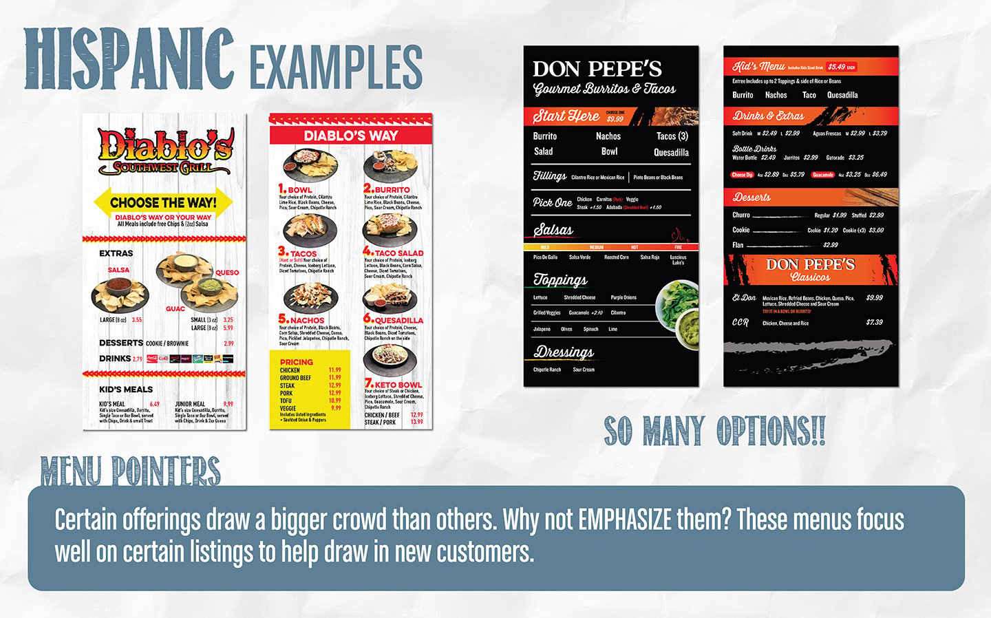
Diablo Southwest Grill and Don Pepe's sell a similar build your own entree, protein, style, toppings, but reach it in different ways.
Diablo Southwest Grill uses food photography throughout, which works well when a brand has strong, camera ready dishes to show.
Don Pepe's uses a consistent header design across sections, a salsa heat scale, and limited text, leaning on layout and color instead of imagery to keep the board from feeling crowded.
Expert Design Tips:
-
Lay out build your own orders as numbered steps: style, protein, toppings, extras.
-
Use real food photography where you have it, but only if the photos are genuinely appetizing. A weak photo hurts more than no photo.
-
Consider a bilingual board if your customer base calls for it.
Bakery & Ice Cream
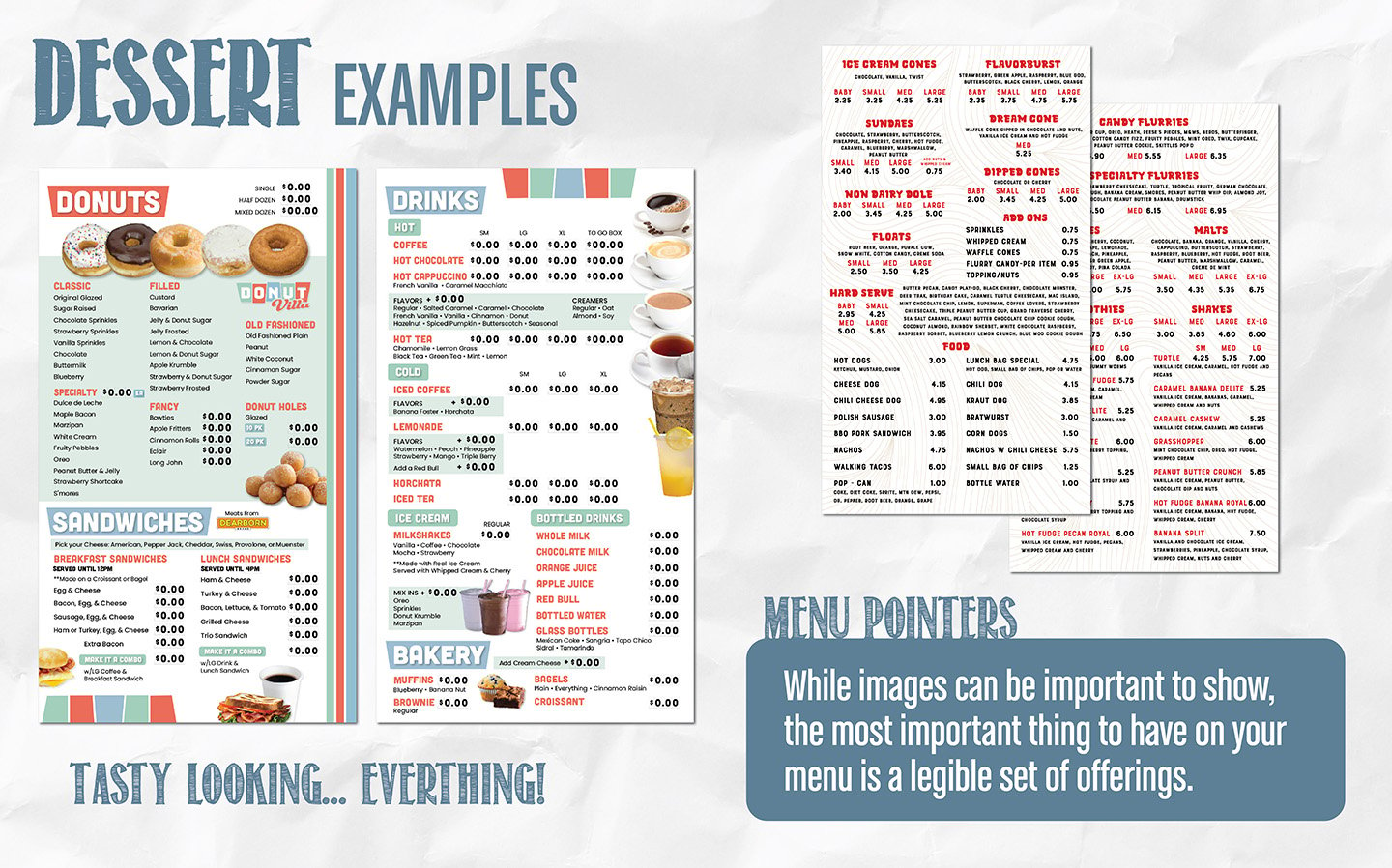
Bakery and ice cream menus rotate as often as daily.
The bakery board here leans on pastel colors and donut photography anyway, with clear blocks separating sections so a big offering list does not read as one long wall of items, and pricing built for easy updates as costs change.
The ice cream board takes the opposite approach: sundaes, flurries, and melts sit in dense but readable price grids, broken up with bold type instead of photography.
Expert Design Tips:
-
If space permits: Use oversized photos of your top three items. Impulse buys start with a picture.
-
Put sizes and prices in grids. Dozens, sundaes, and flurries all follow patterns.
-
Skip descriptions and images on items that are common
-
Use simple icons for dairy free or gluten free.
-
Let the physical case show the product. Ask the board to handle what the case cannot
Asian Cuisine
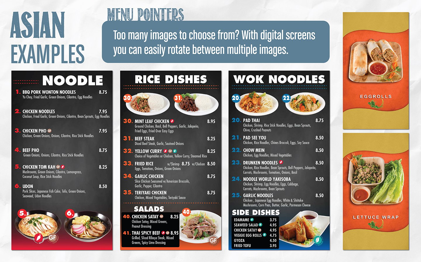
This drive thru board splits its limited time offer into its own section, built to flex independently from the core menu as offers rotate.
Top sellers get photography, every other dish gets a name, a short description, and a price, and small icons stand in for dietary flags instead of longer text.
Color and font changes mark each category, noodle, rice, wok, so the eye can jump straight to a familiar section.
Expert Design Tips:
-
Number every dish and group by type: noodle, rice, wok, sides.
- Use one small icon legend for gluten free, spice level, and vegetarian instead of repeating the words under each dish.
- Align every price in a clean column. Scanning fifty dishes should feel effortless.
Car Wash
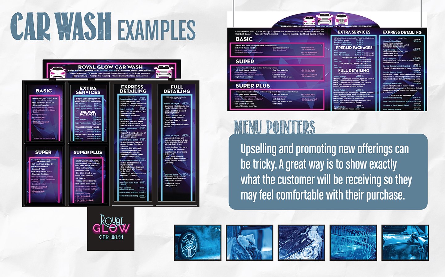
A car wash menu is read from the driver's seat. Each wash tier gets its own column with contents listed in full, so the upgrade sells itself.
The neon glow styling here matches the wash's own branding, and contrast colors help keep everything legible. A topper with additional branding on the menu board also adds extra space and makes the whole design feel cohesive.
Expert Design Tips:
-
One column per tier, contents listed in full. Upgrades sell when drivers see exactly what they add.
-
Highlight your best value package visually, most buyers pick the highlighted middle.
- Design for distance: high contrast and large font size
Banks & Credit Unions
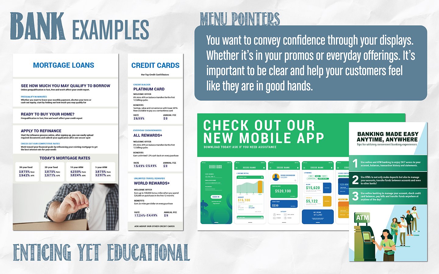
Confidence is the design brief. Rate boards, card comparisons, and app promos here stay clean and educational, so customers feel informed rather than sold to.
Both examples promote the same kinds of content, mortgage rates, credit card offers, a mobile app, but take different approaches: one uses neutral colors and a calmer layout, the other leans on higher contrast and more visual elements.
Expert Design Tips:
-
Keep the tone educational: explain the product, then invite the conversation.
- Step by step ATM and app guides cut teller line questions and give a better customer experience
- Use white space deliberately. It keeps a rate heavy display legible instead of crowded.
Grocery
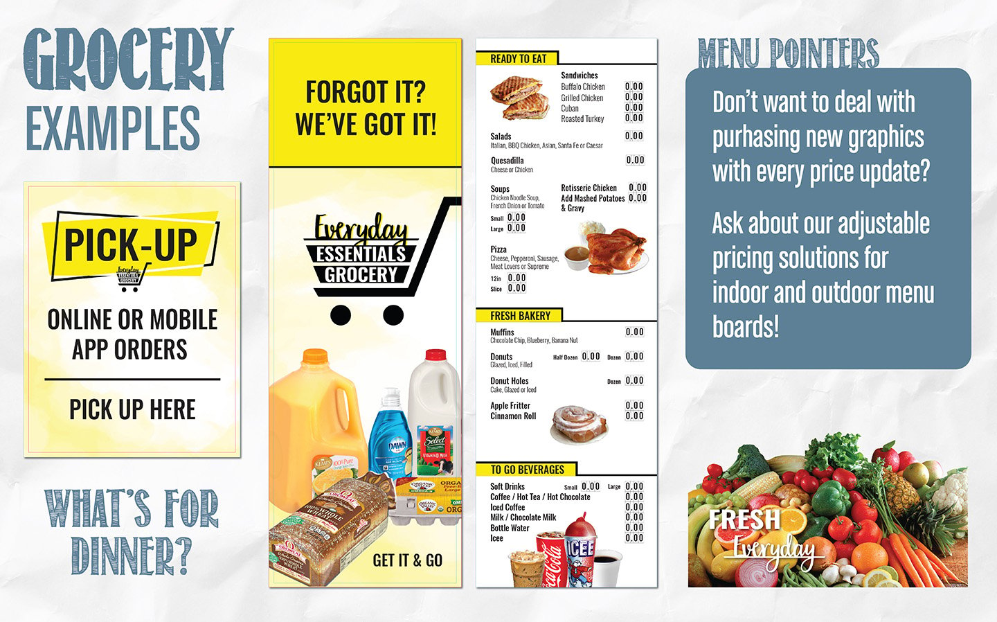
This set covers a bakery list, a ready to eat menu, and pickup and window signage, all with different content but the same header font and color system throughout.
Grocery shoppers scan prices while moving, so pricing leads every layout here, and the system is built so a daily price change never requires a new graphic.
The bigger idea behind this set: a grocery store cannot upsell with a verbal suggestion the way a restaurant counter can, so the signage itself, what a shopper sees walking the aisle, has to do that job instead.
Expert Design Tips:
-
Make the price and the product photo the two biggest elements on any grocery sign.
-
Use window graphics and pickup signage to reinforce the same items promoted inside the store
- Design one system, shared fonts, colors, and layout, then flex the content per department. Consistent, but distinct enough to navigate.
Request a Menu Board Designer Consult
Meet with one of our expert designers to get started on a design or review your current setup and explore ways to improve.
If requested, we can also run your menu board through our specialized analysis software, which scores its strengths and weaknesses and helps guide our recommendations with real data.
Menu board design questions, answered
What makes a good menu board design?
A good menu board is legible from a distance, matches your brand, and guides customers to a decision quickly. The essentials: readable fonts, high contrast colors, appetizing photography, logical grouping, and pricing that is easy to scan.
On digital boards, motion should highlight items, not distract from them. When having rotating sections it is best practice to have the screen show it for at least 7 seconds.
Do I need finished branding before you design my menu?
No. If you have a logo, we can build from there. If you have full brand guidelines, we will follow them.
Our designers regularly work both ways, refining existing menus or creating a look from scratch.
What is most important is to have a rough list of what you would like on your menu or displays.
Most designs begin with a mood board to make sure the design direction is headed the right direction before we work on it for too long.
Can you match my existing brand?
Yes. Send us what you have, logo, colors, fonts, existing menu files, and we will review it to see what's usable. We've worked with customers who had complete brand files and customers who had almost nothing; if you don't have brand files, we can recreate the look or get as close to it as possible.
How long does a menu design take?
It depends on scope more than anything else: how many boards or screens you need, whether you're supplying content or need it created from scratch, and how much you want to manage yourself afterward, a simple template versus a fully editable one.
A single static board with content already provided can take just a few hours. A full digital rotation with custom templates, video, or animation takes considerably more.
Most projects fall somewhere between 5 and 30 hours of design time, and a quick consultation is the fastest way to get a number specific to your project.
Additional Resources
PUBLISHED: AUG 5 2026
On The Branding Signage and Technology, the design team discusses best practices on quality food images on menu boards and tips on getting better pictures.