
Updated July 2026
Your menu board is the first impression of your restaurant or retail space, and a well-designed one directly improves your top and bottom lines. These best practices walk through the design process in order: analyzing your brand and menu mix, deciding between digital and static, laying out the board around your space, and making the visual decisions, indoors and out.
The fundamentals apply to every board, but whether you go digital or static changes how you apply them. You'll find one Digital vs. Static Tip in each section showing where the mediums split.
Start With Your Brand and Menu List
The groundwork is very important groundwork before you start having fun designing your menu. Expect to spend real time going through your current menu (or developing a new one) and making hard decisions about what stays and what goes.
Define Your Brand
Start by answering these questions:
- What do you want your brand to say?
- What is your brand's personality?
- What are your brand's colors and fonts?
- Who are your best customers?
- What are you most known for, and what do you want to be known for?
Sort Your Menu into 4 Categories
BAMs: High profit, high popularity. Highlight these on the menu.
Winners: Low profit, high popularity.Show you have them, but don't spotlight them.
Specials: High profit, low popularity. Display creatively to turn them into BAMs.
Mehs: Low profit, low popularity. Minimal focus, or cut them.
Hidden cost alert! Slow speed of service costs you money. Factor prep time and service speed into every menu item evaluation.
Decide Digital or Static
You defined what you're selling. Next decision: what kind of board? This choice shapes design decision after it. Two questions narrow it down fast: how does your content change, and how much light is in your space?
How Much Light is in Your Space?
Available light points you toward the right hardware. A dim space benefits from a backlit illuminated board or a digital screen that produces its own light, while a bright, well-lit space can carry a non-illuminated board just fine. Outdoor boards fighting direct sunlight are their own conversation (see the outdoor section below).
How Does Your Content Change?
The honest answer to "digital or static?" isn't about counting changes per year. It's about what changes and who handles the work.
Changing content more than 6 times a year? It depends on what's actually changing. If it's just an LTO or a seasonal soup, we can design the board so that item is the only thing that gets reprinted. You're not paying to redo the whole board for one rotating listing.
How Much Light is in Your Space?
Available light points you toward the right hardware. A dim space benefits from a backlit illuminated board or a digital screen that produces its own light, while a bright, well-lit space can carry a non-illuminated board just fine. Outdoor boards fighting direct sunlight are their own conversation (see the outdoor section below).
Layout Best Practices
Menu sorted, medium in mind. Now arrange the board. Start defining the layout using a spreadsheet on excel.
Confirm the Size of The Menu Board
Your space shapes your layout before a single item gets placed. Confirm the size of the menu board and its graphic size. If digital, define the orientation and the size of the screens. Even with room to spare, define a target size.
Knowing these things matters because:
- The size of the menu space and how it is mounted defines your font sizes
- A tight design space is a constraint: it may mean trimming offerings, cutting descriptive text, or shrinking imagery to keep listings legible
- Content gets grouped differently across the number of screens or panels and how they're oriented
Less Is More
Customers typically skim a menu board. When a line forms behind a guest, they feel pressured, scan for something familiar, and stop exploring. A well-designed board works with that pressure by pulling the eye straight to your BAMs.
-
Avoid displaying too many items
-
Keep it to 7 choices or fewer per category
-
Shorter menus = faster decisions = better speed of service
Find Your Hot Zones
The hot zone is the area customers see first and most often. Keep in mind it isn't fixed: your layout, the colors and contrast you use, your imagery, and more can all shift where the eye lands, which means your design choices can strengthen the hot zone or accidentally work against it.
- Where it usually is: Top center, where the eye naturally goes
- What can shift it: How customers line up and where the order point sits (usually near the registers)
- What creates it: The right combination of location, real estate, color, imagery, and clarity
- How to check it: Heat maps. Blue/green zones = commonly viewed. Yellow/red zones = the most frequent, engaged attention
The Howard Company's design services come with complimentary heat zone mapping using trained software. Bring us your current menu layout as a starting point, or have us map it from scratch, and we'll show you exactly where your customers' eyes are going before you commit to a design.
Match the Layout to Your Order Area
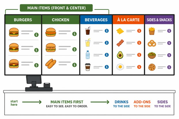
Left-to-right or right-to-left order station: Main items sit immediately visible at the register. Beverages, à la carte, and sides go to the side.
Walk-up counter with multiple stations: Customers look to the middle first, not left to right. BAMs and Specials go center. Add-ons (beverages, sides, à la carte) go left or right.
This order works with how the eye naturally travels, but it can be affected by your hot zones and how you design your menu board, especially with contrasting elements. A bold color block or a large photo pulls attention out of sequence, so make sure your design reinforces the flow you planned instead of redirecting it.
Spotlight BAMs and Give LTOs a Home
Treat BAMs and Specials like royalty: larger text, big appealing photos, more surrounding space, and the most surface area on the board. Placing them in the hot zone isn't enough if size, blank space, or color pulls the eye somewhere else.
Give LTOs one dedicated spot in your hot or warm zones. Customers learn to check that same place for what's new. No room on the board? Upsell LTOs with merchandising and point-of-purchase products in-store and at the drive-thru instead.
Design Best Practices
Direction picked, space measured. Now come the visual decisions. An effective menu board looks good, is easy to read, and generates profits. These are the design choices that get you there.
Make It Readable From a Distance
The typical setup: 5 to 6 feet from the first person in line, mounted about 8 feet high. Farther back? Measure the real distance, because legibility comes down to one thing: how far away your guests are standing.
Font rules of thumb:
- Script fonts are design accents only, never menu items or descriptions
- Boards mounted above registers may need angled mounting, which affects legibility and how text and imagery should be sized
- Test at real size: print at full scale and back up until you can't read it, or preview digital content on a comparable screen
Print Font Sizes:
For any printed board, match minimum letter height to your guests' viewing distance:
Digital Font Sizes:
On digital boards, the same point size renders at different physical heights depending on the screen, so minimums shift with screen size:
Match the Look to Your Space and Brand
- Match the atmosphere: a rustic cafe suits a worn wood frame and neutrals; a loud, bright fast-food concept needs a board just as loud
- Carry your logo's colors and typeface onto the board for consistency with your marketing
- Where the personality lives differs by medium: materials (frames, surfaces, chalkboard inserts) carry the brand on static boards, while motion carries it on digital, used with restraint
- Collect boards you like from other operators and share them with your designer
- Skip the clever details. Easy to read and easy to navigate wins every time
Use Food Photos, in Moderation
- Quality images over Quantity!
- Photos sell, especially to first-timers and guests in a hurry
- Studies show food photos can increase sales by 15% or more
- Prioritize photos for BAMs and Specials
- On digital, a photo can become a short motion clip, which grabs even more attention. Same moderation rule, applied double
- On static, photos need to be print-quality at final size, because a soft image on a printed panel is there until you reprint it
Use Color With Purpose
- Photos sell, especially to first-timers and guests in a hurry
- Studies show food photos can increase sales by 15% or more
- Prioritize photos for BAMs and Specials
- On digital, a photo can become a short motion clip, which grabs even more attention. Same moderation rule, applied double
- On static, photos need to be print-quality at final size, because a soft image on a printed panel is there until you reprint it
Simplify Your Pricing
- Drop the dollar signs. Studies show people order more without them, because the symbol triggers budget thinking
- Avoid One bundled price for combos. "Add fries and a drink for just .99 each" makes people overthink the extra cost
- On static boards, changeable price strips mean a price update costs a small swap instead of a panel reprint. On digital, prices update in software across every location at once
Design for Change
The most overlooked design consideration: your board will not stay the way it launches. Plan for change during design, not after.
Designing a digital board for change: Define zones for each content type: the core menu, the daily special, the LTO spot, the sold-out flag. When content is scheduled to swap, it drops into its zone cleanly instead of breaking the layout. This is the design work that makes "the board changes itself" actually true. This makes updates in the future faster & simplified for everyone!
Designing a static board for change: Decide which areas will change (the LTO panel, the seasonal soup, price strips) and build them as removable panels or magnetic strips from the start. Done right, a seasonal update costs one small reprint instead of a whole new board.
The Quick Overview
The whole process in one pass:
- Know your menu before you design. Sort every item into BAMs, Winners, Specials, and Mehs, and let profitability decide what gets the spotlight
- Pick your medium early. Digital or static shapes every design decision after it. The deciding questions are how your content changes and how much light is in your space
- Design the layout around the hot zone. Eyes go top center first. BAMs and Specials live there, with 7 or fewer choices per category
- Let the space set the boundaries. Exact measurements and the mounting plan come before the design, not after
- Design for readability first, style second. If the customer can't read it, they won't eat it
- Plan for change from day one. Templates and zones on digital, swappable panels and price strips on static
- Respect the outdoors. Bigger fonts, higher contrast, shorter descriptions, and fewer items
Tips worth remembering:
- Your menu mix hints at your medium: lots of rotation leans digital, a stable menu suits static
- Static shows everything at once, so every inch counts. Digital rotates, but the core menu should never rotate away
- Pantone for print, RGB verified on real hardware for digital
- A price change should cost a strip swap or a software update, never a full reprint
- Static changes ship, so build your timeline backward from the date the board needs to change
- Use hierarchy to help the eye flow (graphic below)


SHARE